Axon Health
Axon is a digital platform created to shape the future of healthcare. We design and develop solutions that are of reassurance and simplicity to transform healthcare management by creating a reassuring, easy, and fast experience.
- Date: 2020 - 2021
- Structure: Centralize
- Team Member: 8
- Tools: Figma, Miro, GA
- OS: Web, PWA, iOS, Android
- Screen: +300
- Position: Product Design Director
My Role
I was responsible to transforming the UX and Support development of innovative new business models.
Improve experiences for customers by ensuring high-quality design, including ownership of all front-end interaction points.
Drive design standardization across the organization with biennial design-standard reviews.
Training sessions per year for designers
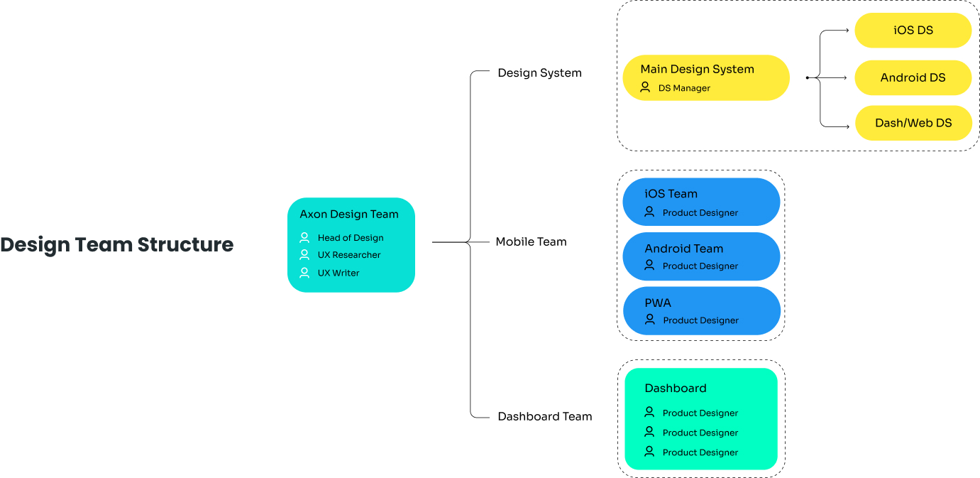
I set up a team in a centralized model with 8 people, in different positions, like a Ux researcher, Ux Writer, and Product designers.
Spread design by creating a common language and set of practices across organization it’s was my another responsibility.
Problem
Before me, Axon had a design team, but without a clear goal and right structure, and they designed a beta version but they failed. I joined the axon and started to skill-up a team and hiring fresh and new talent, I started from:
- I set up new Team, New Topology
- I Designed a grading system for assessing them and drew a clear roadmap based of people assessment results to increasing motivation and clear career path
- Increasing Team Knowlaged
- Immigrate to Figma
- Redefine Product Design Vision and Strategy
- Product Strategy
- Design System
- Design Roadmap
Process and Team Structure
Axon
Telemedicine
App
Screen
+160
OS
Android , iOS, PWA
Itreation
+50
Team
4
What I Did?
Simultaneously, while provided ongoing develope, design and support to our product and technical teams, we remained steadfastly committed to our customer-centric approach. This entailed conducting extensive research to deeply comprehend user requirements and align them with our business objectives, thereby creating a valuable proposition that consistently yielded enhanced outcomes.
—
These steps were done before or simultaneously during the development of the product and do not indicate the sequence of steps or our work process.
1.
Business Goal
Doing Interviews and workshops with stakeholders and domain experts to define and understand the clear business goal
2.
User Need & Persona
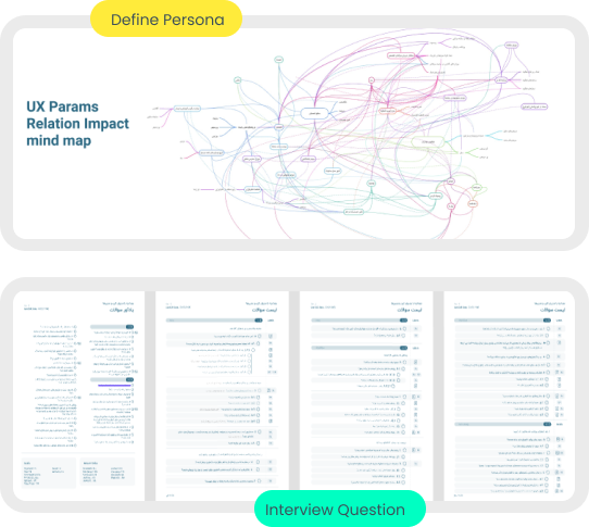
Doing an interview with customers ( Doctors, Clerks, and Patients) – To define a persona and analysis their behavior and their pain and gain – we want to know the target groups and what is the user goals and needs
3.
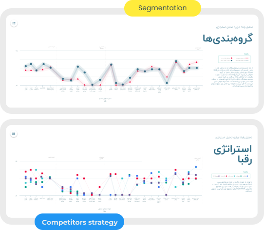
Blue & Red Ocean
By using Blue Ocean and Red Ocean Strategy for our top 5 competitors, we find our value proposition.
4.
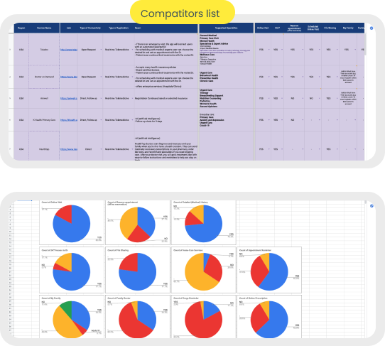
Competitors Analysis
we created a best practice list with more than 30 competitors and analyze them carefully with all their features and made a report for each of them.
5.
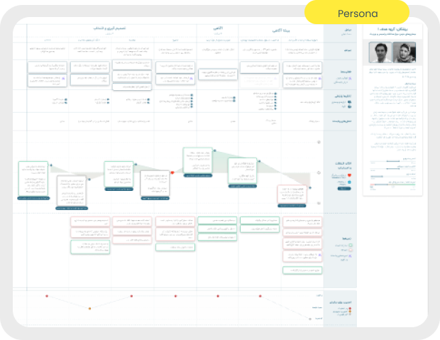
Customer Journey Map
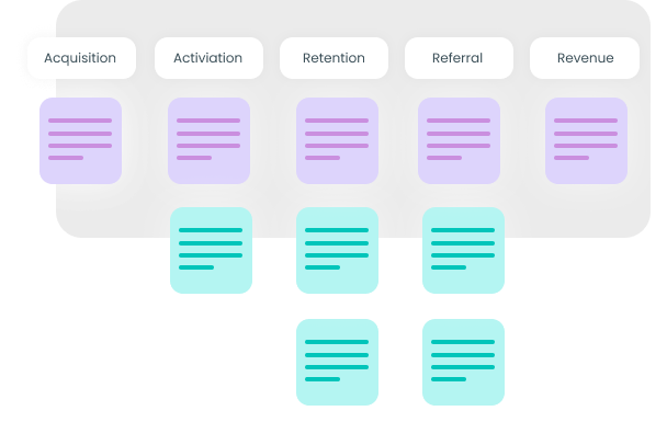
To step into customers’ shoes to better understand their pain points and challenges, their Emotional connection, and to achieve Better ROI, we designed CJM.
6.
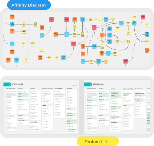
Start to discovery and feature brain storming
We ran a feature brainstorming workshop with stakeholders, with relay research results. we achieve a lot of awesome ideas… and we prioritized them in the roadmap
7.
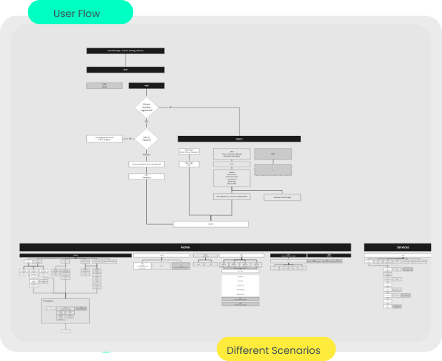
Design User Flow
we started to draw a journey in the user flow model that each user should be taken
8.
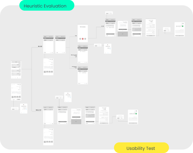
Wireframe
with consideration of usability roles, and constraints,… we started to design a wireframe.
9.
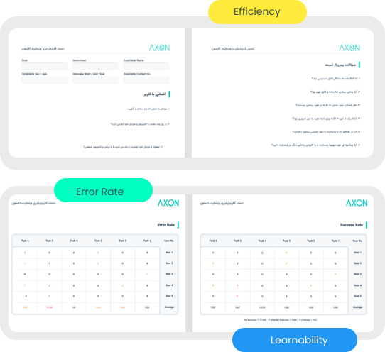
Usability Test
After each section, we had usability testing to ensure that our goals were met. we considered findability, we did it at the beginning of the design and after finalizing
10.
Design System
Besides UI design, we started to create a scalable design system by considering of material design and human interface design languages. Consistency was very important to us, and it was one of our big strategies. Since we have two different products in the shadow of one brand, our Design System should be designed very carefully. We divided it into Main Design System, Mobile, and Desktop.
11.
UI Design / Prototyping
Finally Ui design and prototyping. after ensuring about the wireframe and considering the development team based on the road map we started to design part by part UI. according to our persona, accessibility was very important to us, and we tried to observe until the AA level of accessibility. After each part, we made a prototype and had a usability test with the real user and if we needed to iterate, we iterated.
Axon EMR (eRX) App
Screen
+150 - Ipad - Desktop
OS
Android , iOS, PWA
Itreation
+60
Team
4
What I Did?
Almost all steps in the telemedicine part were repeated for the EMR part.
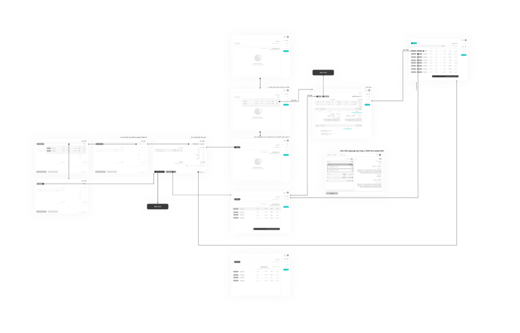
Wireframe
with consideration of usability roles, constraints,… we started to design a wireframe.
UI Design / Prototyping
Finally Ui design and prototyping. after ensuring about the wireframe and considering the development team base on the road map we started to design part by part UI. according to our persona, accessibility was very important to us, and we tried to Observance until the AA level of accessibility. After each part, we made a prototype and had a usability test with the real user and if we needed to iterate, we iterated.